Nestle at NACS 2022
INDUSTRY: Trade Show
Download PDFChallenge
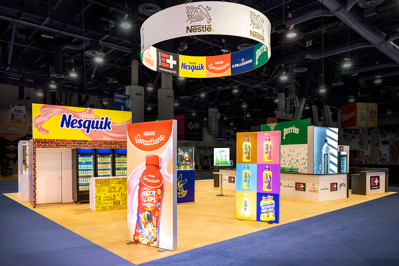
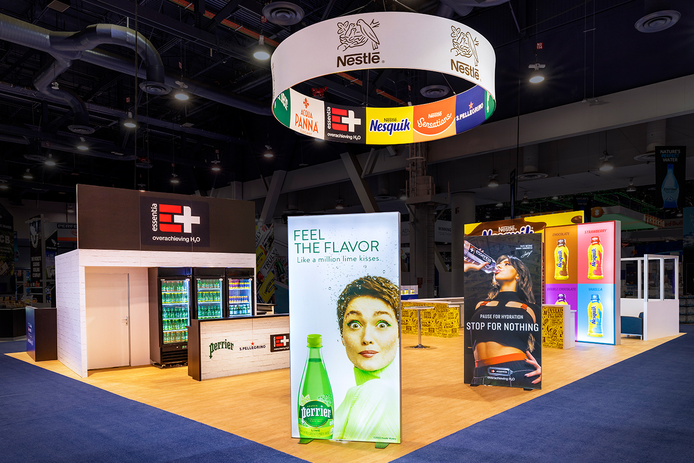
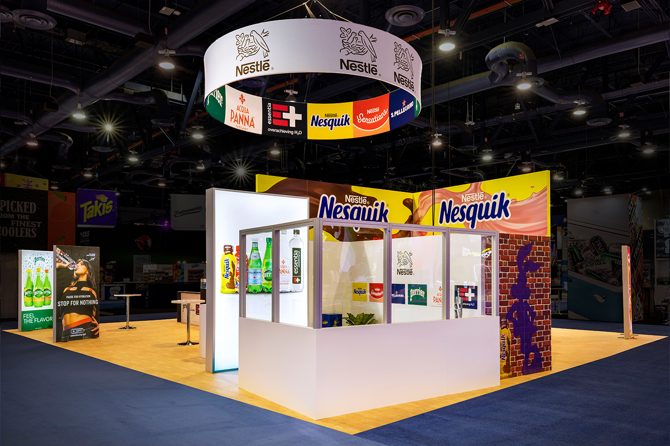
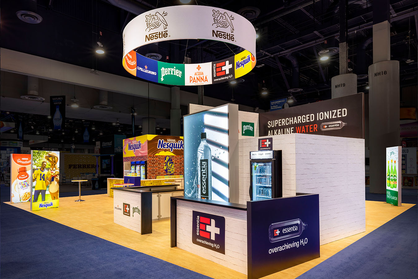
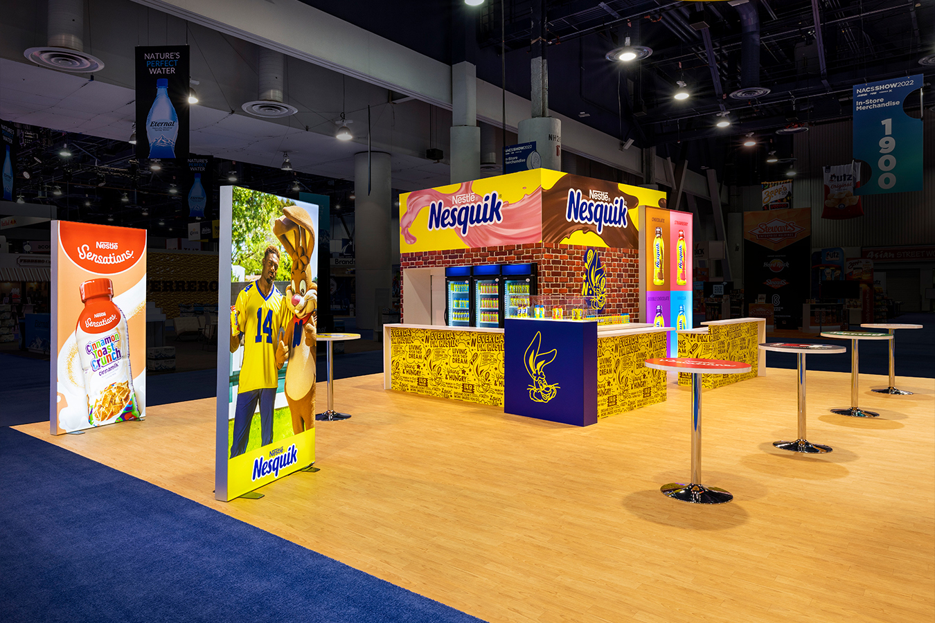
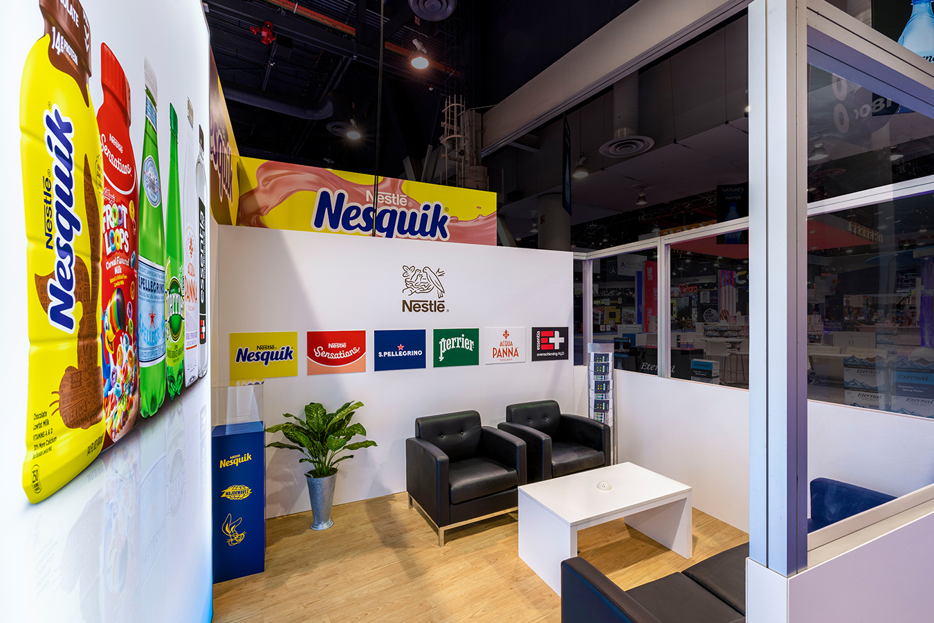
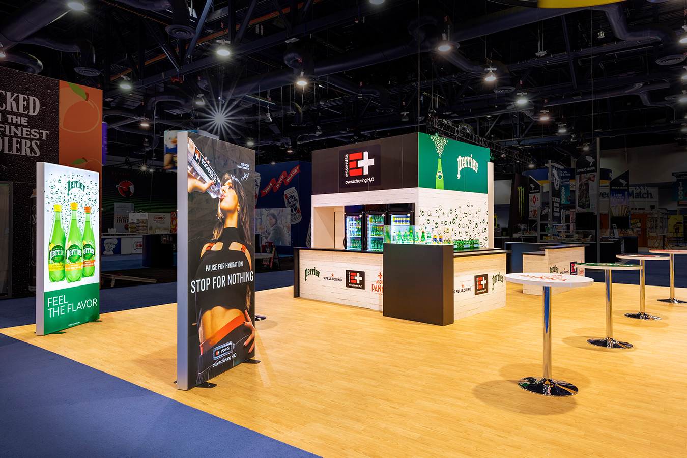
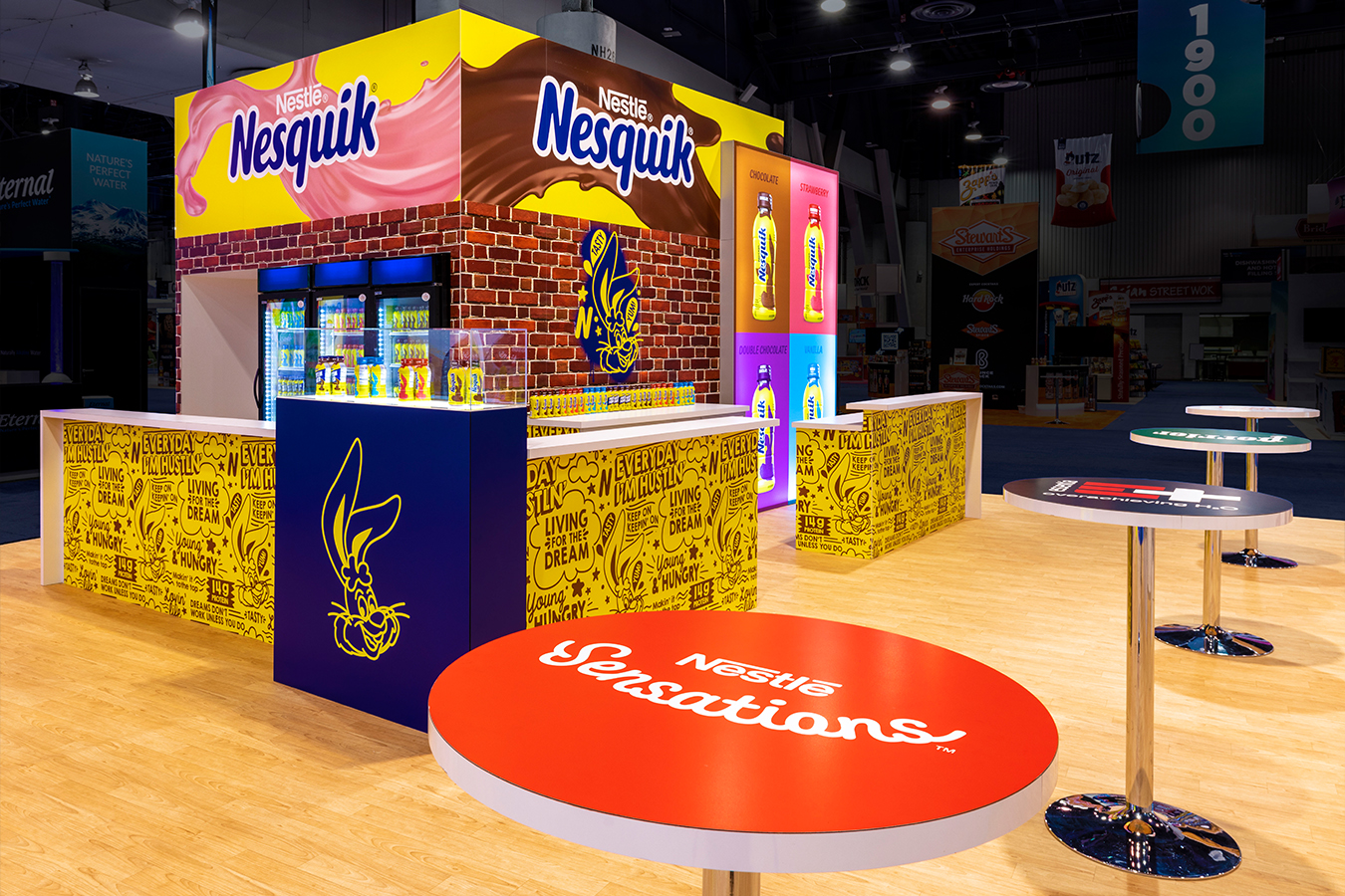
Branded. But not overly corporate. Big. Inviting, to encourage sampling of new products. Colorful and buzzy to draw attention to Nestle and its portfolio of convenience store brands. Spacious enough so retailers and distributors could converse comfortably. They trusted 2020 Exhibits to check every box on their list. Our client requested a rental exhibit for the NACS (National Association of Convenience Stores) Tradeshow last year. In addition to Nestle, they wanted the space to showcase their participating brands’ personalities and voices. We’re known for our masterful custom exhibits, interiors, and signage. True. But we’re also home to the country’s largest customizable exhibits rental inventories. So, you don’t have to settle for a prefab cookie-cutter exhibit. We’ll help you mix and match, say, a giant hanging LED screen from here, and an enclosed meeting room from there. Our challenge with Nestle USA? Create the optimal configuration to meet requirements and maximize results.
Solution
Our award-winning designers rendered an artful, spacious, and balanced floorplan for a whopping 40x50’ rental exhibit. With Nestle’s go-ahead, our awesome graphics team brought out a full color palette of popping power and creativity to brighten the space. Backlit signs were intentionally spaced at specific intervals throughout. These brilliant LED light boxes proved ideal for showing off our client’s various brands. Our art & graphics experts didn’t stop there. They treated the entire 40x50’ trade show booth as a giant, 3-D canvas that not only complied with Nestle USA’s mandatories, but through the use of fun, engaging photography, prominent logo treatments, and fun illustrations of product mascots applied to every available surface, attendees couldn’t miss the opportunity to step inside. Teams across 2020 Exhibits worked together seamlessly to curate, coordinate, and install custom fabric-covered signage & display counters to the furniture and tables that made the best use of form and function. Once on-site at the Las Vegas Convention Center, our expert installation crew cast a keen eye on ensuring the entire 40x50’ exhibit area looked precisely on-point and true to the approved layout/rendering. Handsome flooring. A sizable, circular hanging sign that gave every brand within the Nestle USA exhibit equal space to shine. Bright, colorful staggered LED backlit signage with engaging photography. Branded tables placed at intervals for symmetry and style made for great places to convene or simply enjoy refreshing beverages. Again, our masterful, experienced teams at 2020 Exhibits worked tirelessly to ensure we didn’t just meet our client’s expectations but exceeded them. All elements incorporated into the exhibit design came together beautifully to create a popular and EFFECTIVE exhibit for Nestle USA at the NACS Show last year. Bubbles (Perrier bubbles) for everybody!


