Autodesk
INDUSTRY: Software
Challenge
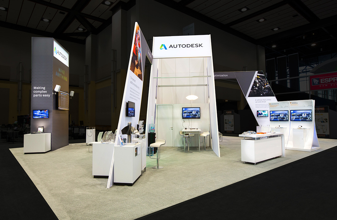
Going into the International Manufacturing Technology Show, Autodesk Inc. wanted to approach its new exhibit design from a whole new angle — literally. The 3-D design, engineering, and entertainment software hoped to devise an eye-catching and impressive experience that would speak to it's logo's angular elements while maintaining a light, bright, and open architecture to draw visitors into the 40x50 ft booth.
Solution
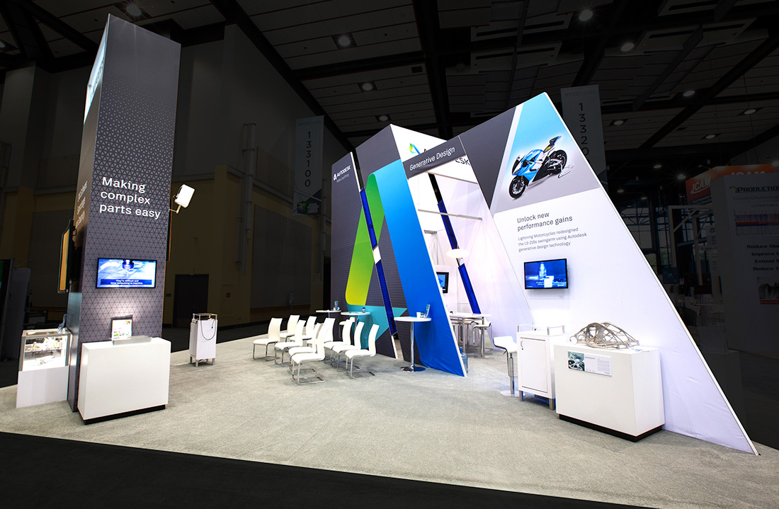
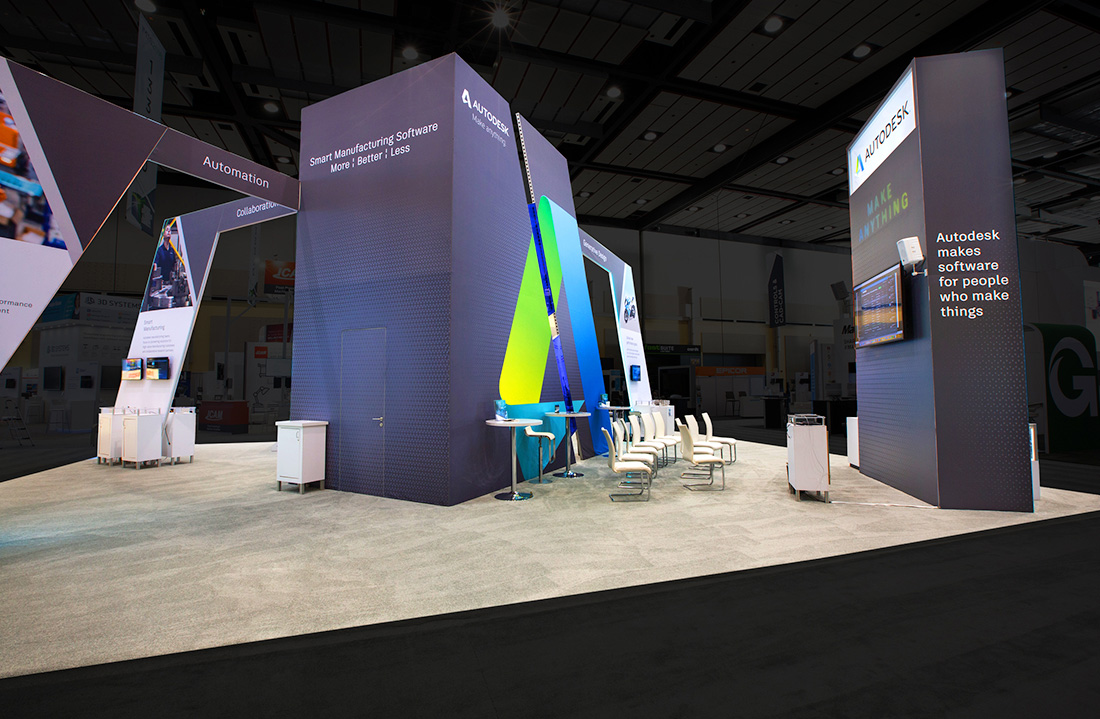
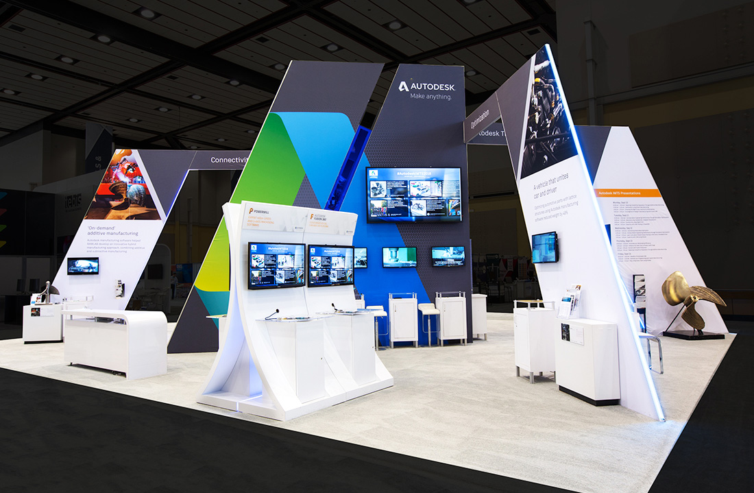
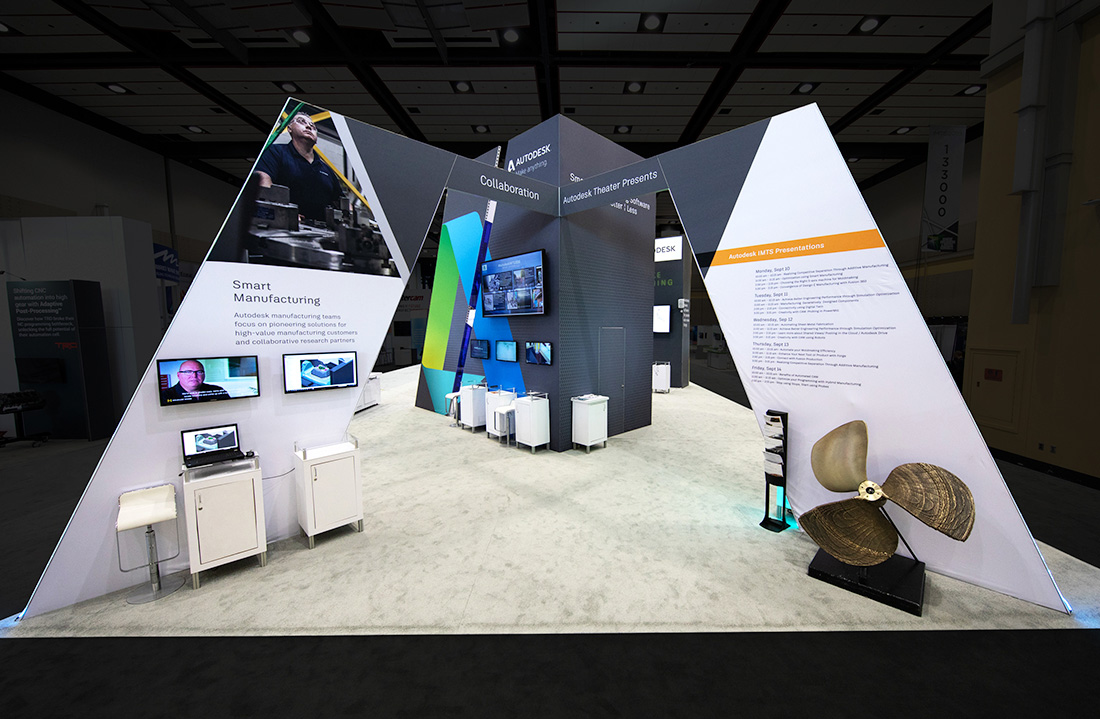
Employing fabric silicone-edge graphics, the 2020 Exhibits Design Team devised an exhibit that is an impactful marriage of strong diagonals, lightweight materials, and an inviting floor plan. Throughout the environment, Autodesk’s rich blue, green, and gray hues branded the space and spotlighted.
At its core, the design featured a central 20-foot tower that anchored the footprint and served as an identifying beacon visible from aisles away. Three angular arches, which offered graphic imagery, messaging, and attached monitors, protruded from the central tower and slanted downward to contact the floor near three different aisles.
To accommodate an in-booth presentation theater, designers positioned a 16-foot-tall freestanding wall on one corner of the experience.The structure formed the theater's backdrop, featuring the Autodesk logo and the attached 50 inch monitor, while ten chairs, and a smattering of bistro-high tables and chairs offered ample sitting. Aside from a reception desk and freestanding kiosk providing product demos, designers positioned all floor-based displays adjacent to the arches — a tactic that ensured the interior space remained open and supported an effortless flow of traffic into and throughout the space.


