Alteryx
INDUSTRY: Software
Challenge
The Tableau Conference is known to be one big data love fest. The experience is big, bold, and bodacious so as top sponsor of #TC18 and its annual gathering for lovers of systems, data, stats, and facts, the Alteryx exhibit experience needed to hit the mark. As the Alteryx mission declares, “Our mission is to unleash the thrill inherent in solving problems, using our platform to fuel remarkable business and social outcomes.” In a nutshell, to create a thrilling and compelling experience that showcases this passionate brand for an undeniably exuberant worldwide audience. So when cool, sleek and streamlined technologies are the name of your game, your environment best be the polar opposite of bulky, clunky or chunky. With the Alteryx exhibit environment claiming center stage in space filled competing sights, sounds, and attractions, it was time for Alteryx to boldly own the space as the coolest belle of the ball. A compelling, crisp, polished, modern presence called for tech-savvy interaction and engagement.
Solution
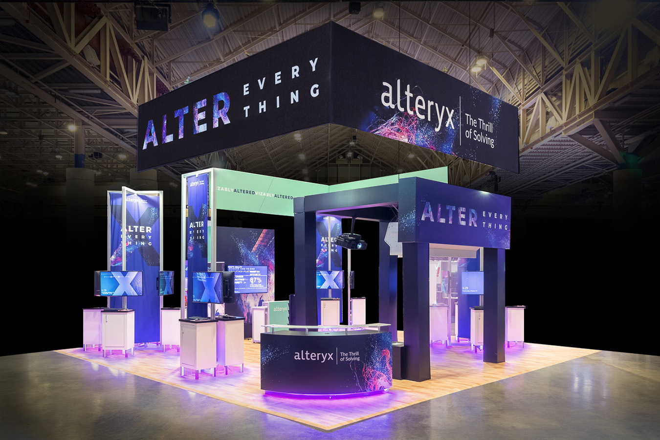
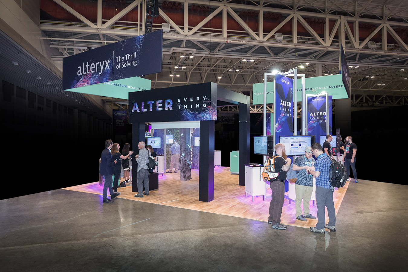
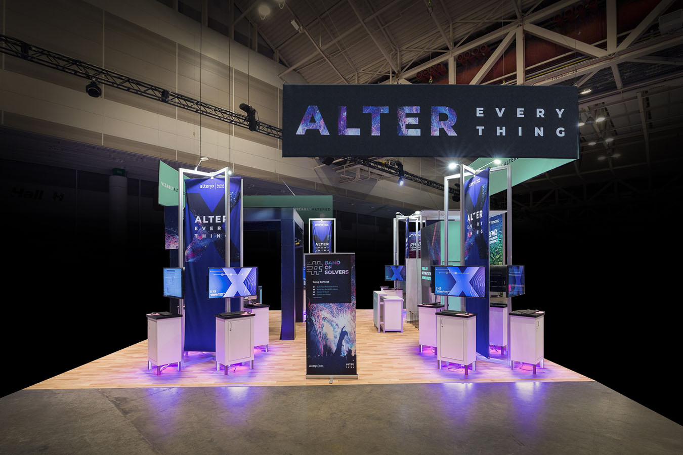
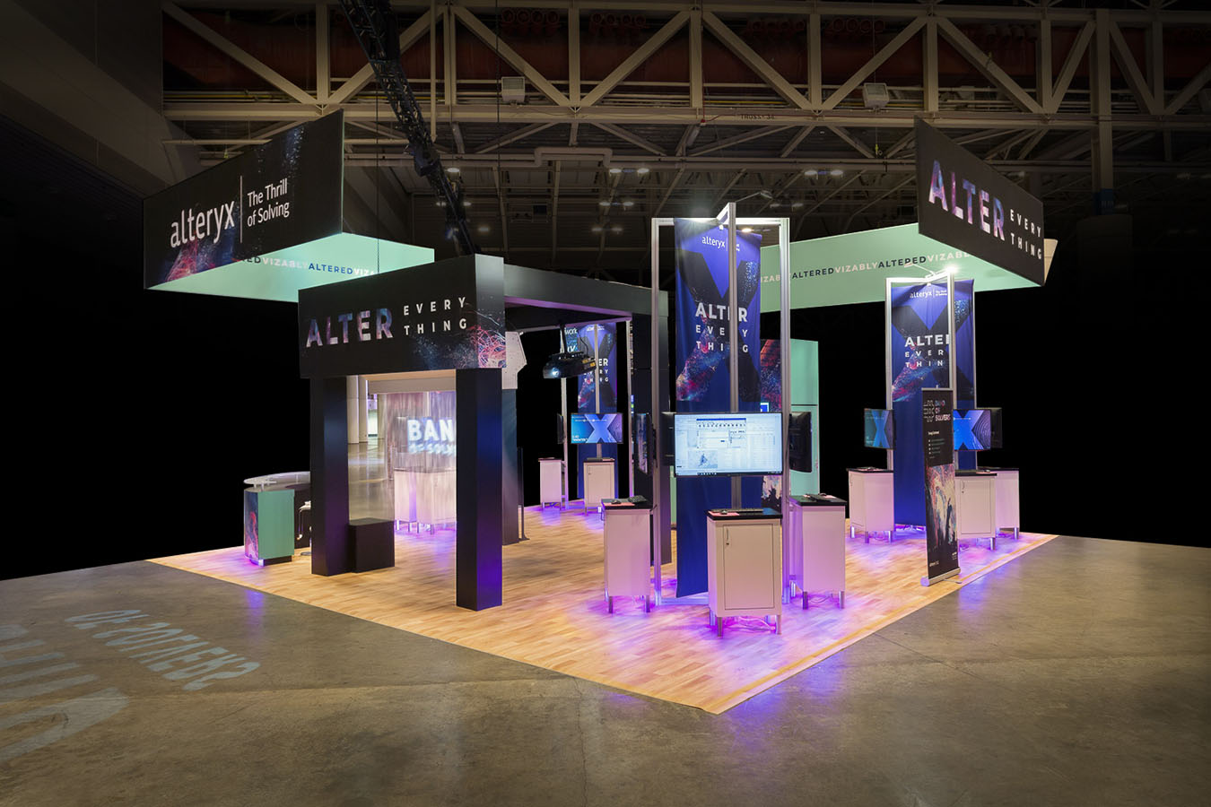
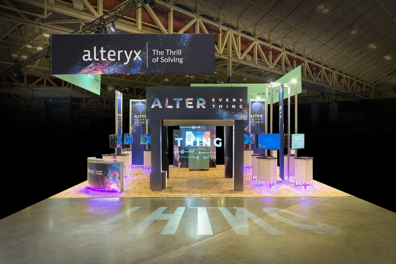
It’s about bringing all parts of the Alteryx brand together in one engaging, inviting, compelling, and captivating environment to deliver a game-changing experience. And to execute in a way that is thrilling. Every angle, corner, and turn of the environment’s design was purposeful and strategically considered, with drama and intrigue from the start, in a bold entry and anchor: a fog screen at the entrance, with branding and messaging rear-projected to captivate and entice attendees to step inside. This captivating walk-through projection screen and unexpected visual delight entry led to a fun and interactive game experience that is strategically located in the heart of the experience, at an open engagement counter and area. And with 14 demo kiosks strategically throughout the space acting as magnets to attract and engage, visitors could see and experience the thrill of the Alteryx brand. Dynamic, bright, and modern, with bold branding, and an inspired look and feel serving as critical drivers for this 30’ x 30’ exhibit space. Bold graphics, strategic LED lighting, and fog. Yes, the fog screen entry is an unexpected surprise, serving to attract and delight. With the Alteryx iconic and highly-recognizable color palette bringing attention sky high, in massive 16’ x 4’ hanging banner signs enthusiastically branding the space, creating an open yet refined vibe. Eye-popping demo stations were strategically organized throughout the environment, ramping up every available opportunity for engagement offering attendees that Alteryx experience to explore. This inviting reception counter, activation/gamification station and an abundance of workstations, were visible from every angle gave the Alteryx Team a savvy way to keep an eye on the traffic and activity, gauge interest and bump up engagement.


